

Jasmine Birtles
Your money-making expert. Financial journalist, TV and radio personality.

![]() Moneymagpie Team
18th Sep 2025
Moneymagpie Team
18th Sep 2025
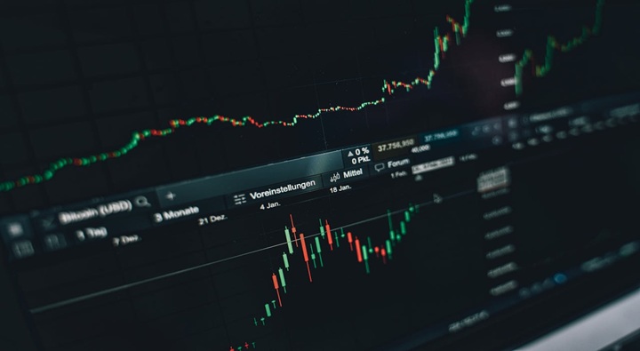
Markets have a way of surprising even the most experienced traders. Prices fall hard, sentiment turns gloomy, and then just when everyone has given up, the chart hints at a possible shift. One of the clearest signs that this might be happening is the hammer candlestick pattern.
It’s one of those patterns that traders love because it’s simple to spot, yet powerful enough to matter. But as with most tools, the key isn’t just knowing what it looks like, it’s knowing when to trust it.
Candlestick charts are more than colourful visuals. They compress a lot of market psychology into a single shape. Every candle shows you where the market opened, how far it stretched in both directions, and where it finally closed.
That’s a lot of information packed into a small space. It tells you not only what happened, but also who seemed to be in control, buyers or sellers. Patterns like the hammer work because they capture a moment of conflict and possible change.
So what exactly does a hammer look like? Picture a candle with a small body near the top, almost no wick above it, and a long shadow stretching down. That “tail” should ideally be at least twice as long as the body.
The message behind it is clear. Sellers pushed prices sharply lower during the session, but by the close buyers had taken back control. The long shadow is proof that the market tested those lows and firmly rejected them.
Not every candle with a long shadow is a hammer, though. The real body needs to sit near the high of the session, showing that buyers finished the day in charge.
A hammer on its own isn’t a magic signal. Where it appears makes all the difference.
This is where hammers are most meaningful. They suggest that the selling pressure which dominated before is starting to crack.
If a hammer forms near a level traders already view as important, the pattern gains credibility.
Heavy trading during the formation adds weight to the idea that buyers are really stepping in.
A higher close in the next session often seals the deal, showing the reversal isn’t just a blip.
Seen in other contexts, such as during a strong uptrend, a hammer doesn’t mean much at all.
Charts reflect human behaviour. Think about the hammer this way:
Early in the session, sellers dominate. Prices fall, and it looks like the downtrend will continue. Then, buyers step in. They don’t just slow the fall; they push prices back toward the top.
By the close, the story has flipped. Sellers had their chance but lost control. Buyers showed resilience, and the hammer is the visual evidence of that shift.
That’s why traders often call it a “rejection” candle. It’s about recognising that one side is no longer as strong as it was.
Of course, not every hammer leads to a rally. False signals are common, especially in choppy markets. To avoid being caught out, traders often look for confirmation and supporting evidence.
Ask yourself:
Did the next candle close higher, ideally above the hammer’s body?
Was there meaningful trading volume behind the move?
Does it line up with other technical clues, such as RSI divergence or moving averages?
Is the broader market environment supportive, or are fundamentals stacked against a bounce?
Using the hammer as part of a toolkit, not as a standalone decision-maker, is what keeps it valuable.
Candlestick charts are full of lookalike patterns, and it’s easy to mix them up.
Same shape, but forms after an uptrend. Instead of bullish, it warns of potential weakness.
Long wick above, small body at the bottom. It can still mean reversal, but it’s less reliable without strong confirmation.
Almost no body at all. This one reflects indecision rather than rejection.
Getting these distinctions right matters. Acting on the wrong interpretation can put you on the opposite side of the market.
The hammer isn’t tied to one type of asset. You’ll find it across stocks, currencies, commodities, and crypto. The way traders respond to it, though, can vary.
A hammer after a long sell-off in a sector stock, say, a beaten-down retailer, might suggest value hunters are stepping in. If earnings later confirm stabilisation, that hammer looks like the early clue.
Currency pairs are heavily influenced by macro data. A hammer forming near a known support level, such as EUR/USD bouncing after testing a yearly low, can be an early signal that traders are reassessing.
With its wild swings, crypto produces plenty of hammers. The challenge here is filtering out noise. Many “false hammers” appear during sideways chop. That’s why confirmation is even more critical in digital assets.
Traders who integrate hammers into their strategy usually combine them with other tools. A typical approach might include:
This method keeps the hammer as part of a structured decision-making process rather than a shortcut.
Patterns like the hammer are often taught as part of trading education. Brokers such as ThinkMarkets highlight these formations in their resources, helping traders see how they fit into broader technical strategies. For newer traders, having access to explanations and chart examples makes a big difference when learning to separate real signals from random shapes.
In an era where algorithms dominate and AI scans charts faster than any human, why do traders still care about candlestick patterns? The answer is simplicity.
A hammer tells a story in one glance. It cuts through noise and shows the clash between buyers and sellers in a way even sophisticated traders appreciate. Machines may trade faster, but the psychology that creates these patterns hasn’t changed. Fear, greed, and reversal points are as old as markets themselves.
The hammer candlestick pattern is one of the simplest, clearest signals in technical analysis. When it shows up after a downtrend, with volume and confirmation behind it, it often marks the first sign of reversal.
But its real value isn’t in treating it as a standalone tool. It’s in combining it with other signals, managing risk, and recognising that no pattern predicts the future. Used well, it becomes one more piece in a trader’s decision-making puzzle, a piece that can sometimes tip the balance between catching a reversal early and being caught flat-footed.
What does a hammer candlestick actually show?
It shows that sellers tried to push the price down, but buyers fought back, closing near the top of the session.
How do I know if a hammer is reliable?
Look for confirmation in the next candle, check the volume, and see if it aligns with support levels or other indicators.
Can hammers appear in crypto markets?
Yes, and very often. But crypto volatility means you’ll see many false signals, so always double-check for confirmation.
What’s the difference between a hammer and a hanging man?
They look identical, but the hammer forms after a downtrend (bullish), while the hanging man appears after an uptrend (bearish).
Disclaimer: MoneyMagpie is not a licensed financial advisor and therefore information found here including opinions, commentary, suggestions or strategies are for informational, entertainment or educational purposes only. This should not be considered as financial advice. Anyone thinking of investing should conduct their own due diligence.

Ellen Mines“You’ve helped me find different and affordable ways of saving money every month- so helpful thank you!”
Your money-making expert. Financial journalist, TV and radio personality.